Mobile-responsive web design for travel-planning tool
To round out my UI/UX design skillset, I completed Designlab’s UX Academy Foundations, an 8-week course (~100 hours) that culminated in building a mobile-responsive website using Figma. The client for my project was Wayfarer, an AI trip-planning platform. Wayfarer is a research tool that aims to “unveil hidden gems” and “inspire wanderlust” — it does not directly sell any trips, flights, or accommodations. Wayfarer’s ideal customer profile (ICP) includes frequent travelers, ages 21-30, in search of new adventures. Project objective: implement a net new design for the Wayfarer website to drive signups.
Note: scroll down for design artifacts.
My Role & Design Process:
I was responsible for the conceptual vision through pixel-level design.
-
First, I reflected on individuals’ relationship to travel today.
Insight: Feelings about travel can be complicated
On one hand, travel is an opportunity to see and parts of the world...especially before they’re ravaged by climate change...
On the other hand, it can be disruptive to local communities & ecosystems
Based on the above, I refined the Wayfarer concept.
Expanded concept: Wayfarer not only suggests destinations, but also recommends books, music, food, etc. to steep oneself in the culture before/during/after a trip (or virtually)
I also looked at outside-of-travel-industry examples used by the ICP (e.g., Spotify, Kindle store).
Design implications:
Avoided travel cliches. Instead, sought to enable users to imagine their own travel desires (e.g., used abstract hero image, rather than beach photo)
Used contrasting warm/cool colors to create sense of energy and excitement
-
I iterated on the visual design & content with two main goals in mind:
Demonstrate what differentiates Wayfarer from other travel sites
Activate new users (as measured by increased conversions from form initiation to account creation)
In addition, as part of the website/webform design & build, I focused on creating reusable, mobile-responsive components.
-
Flesh out additional task flows (e.g., toggling between travel modes, providing feedback on the recommendation, and making a purchase based on the recommendation)
Pitch the client solution and revise accordingly.
Continue to build out the design system (e.g., hover states, menus).
What I'm Proud of:
Honed my user interface design skills (Figma).
Raised the bar by taking a creative approach to the Wayfarer project, instead of accepting the assignment at face value.
Completed the coursework on time and with a high degree of quality despite a concurrent demanding, full-time job.
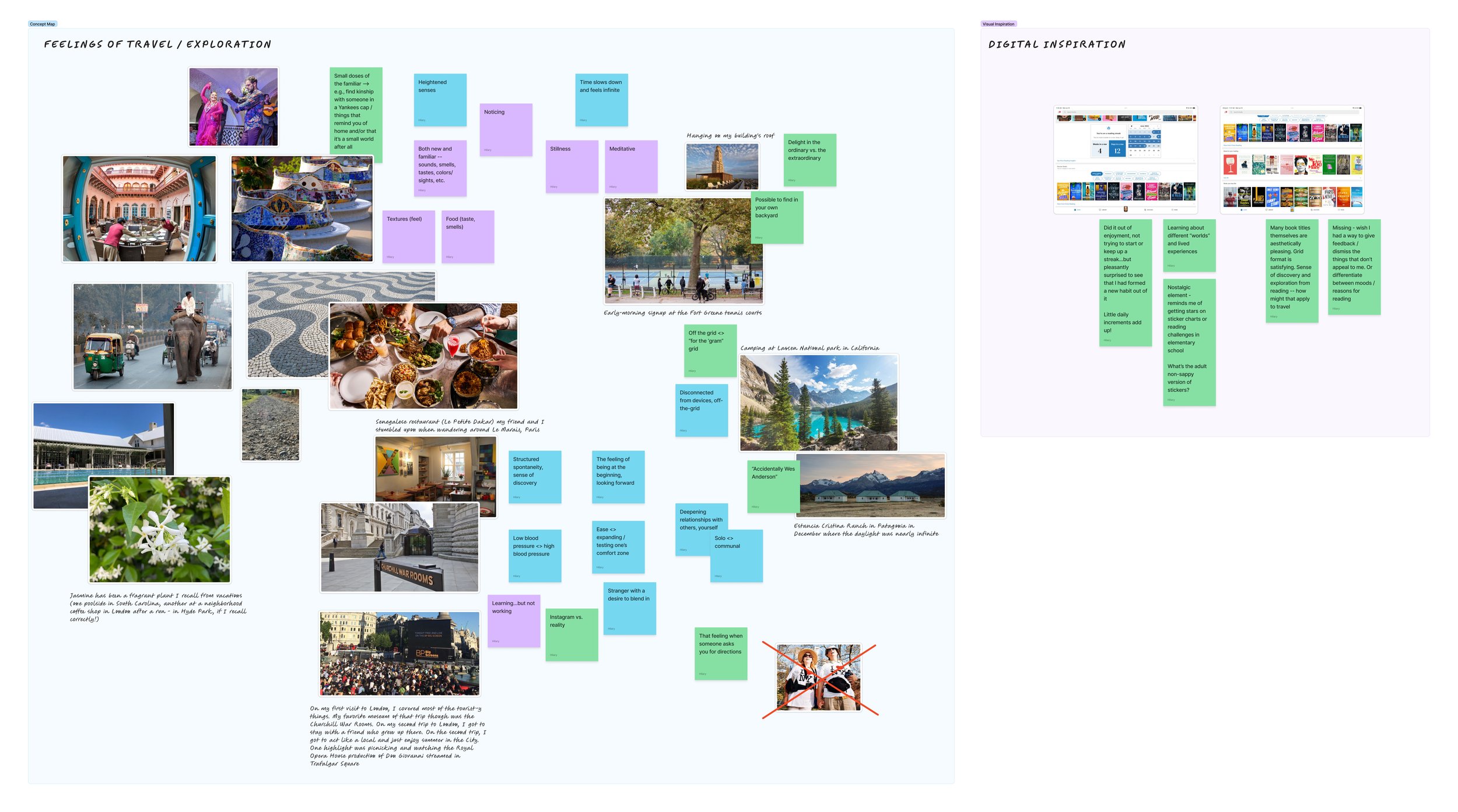
Mind map (Figjam)
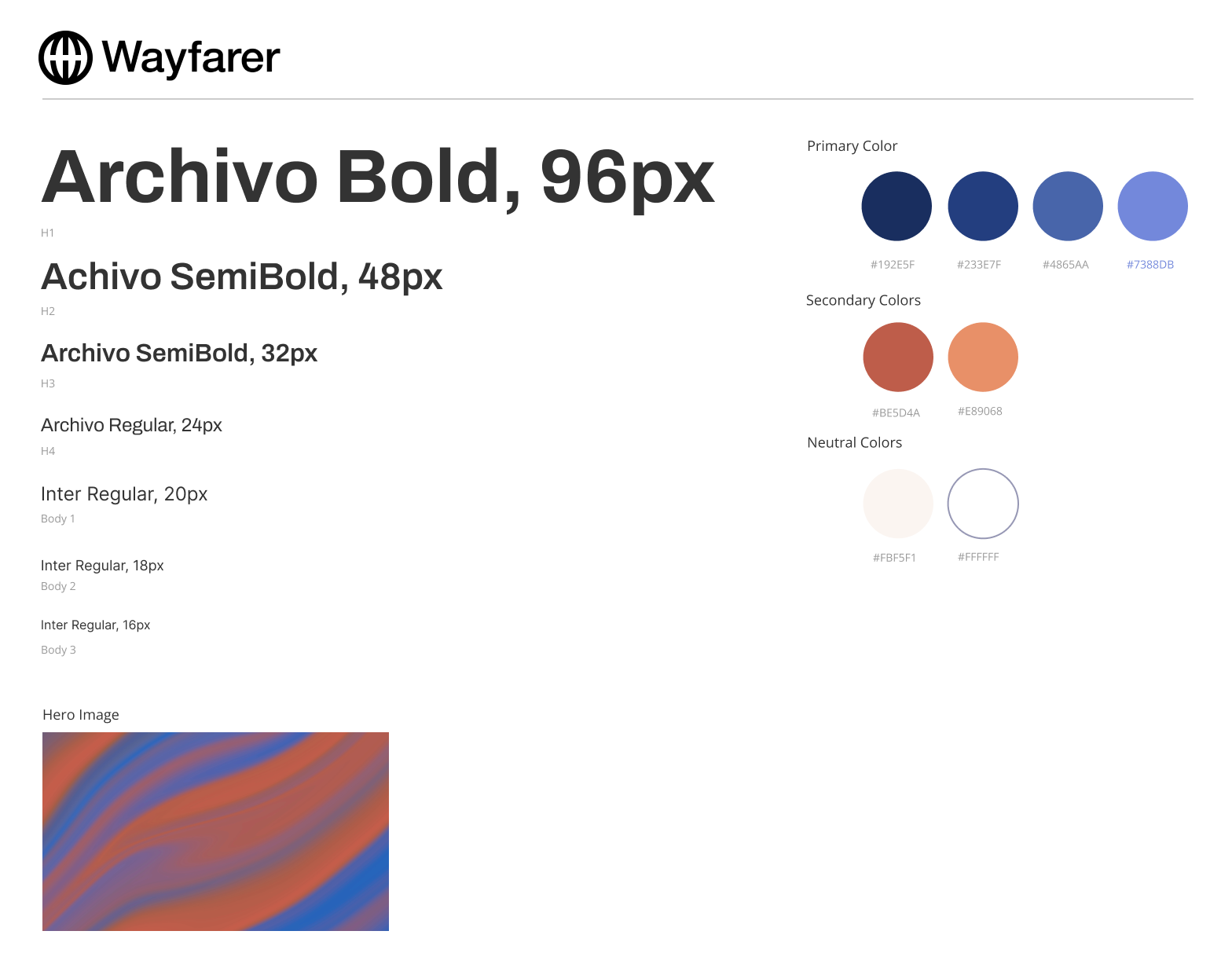
Style tile
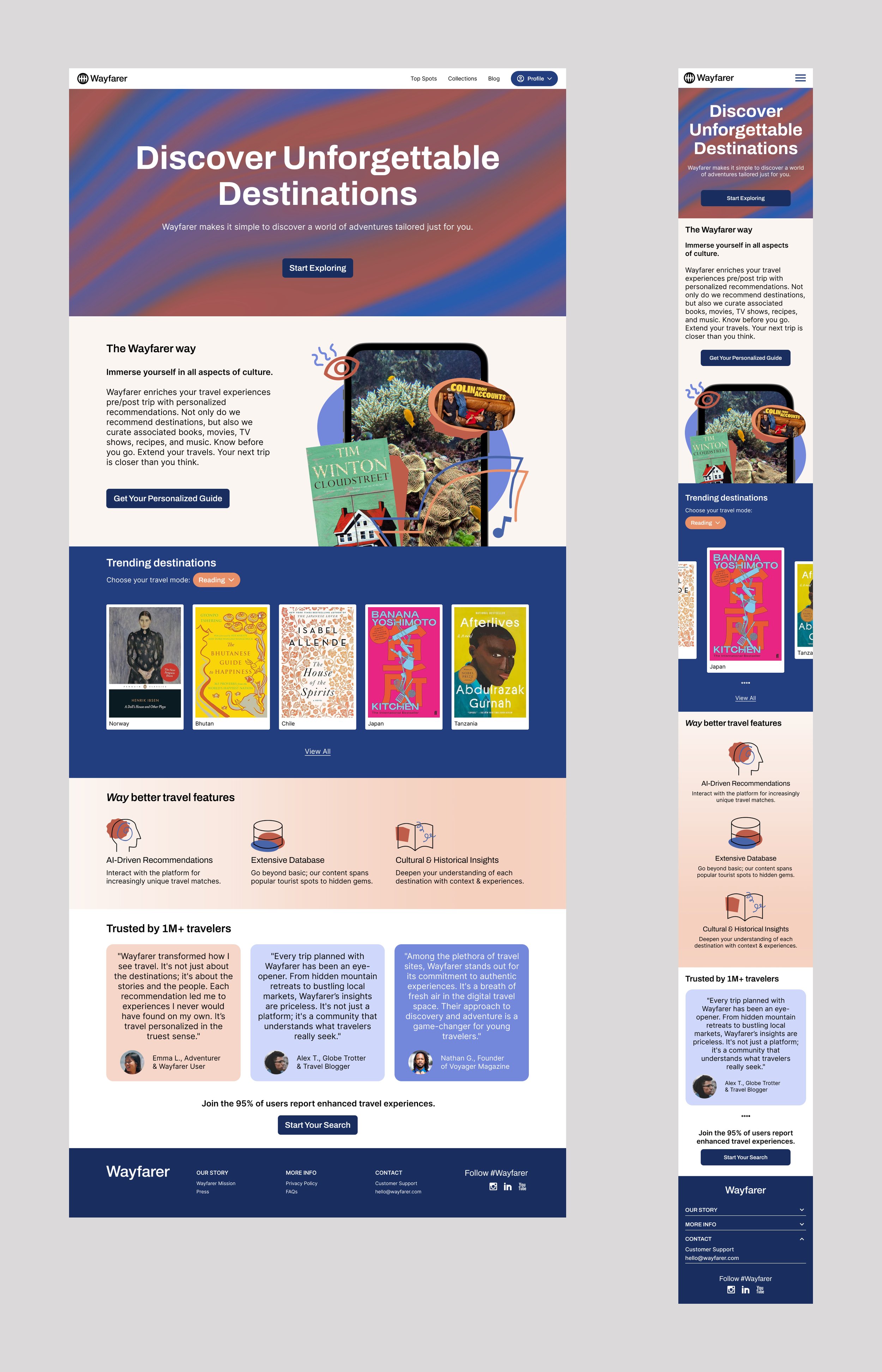
Final design | Incorporates additional explainer content. Improves upon many of the prior UI/UX elements. Call to action (CTA) repeats throughout page to make it easy for the user to take action
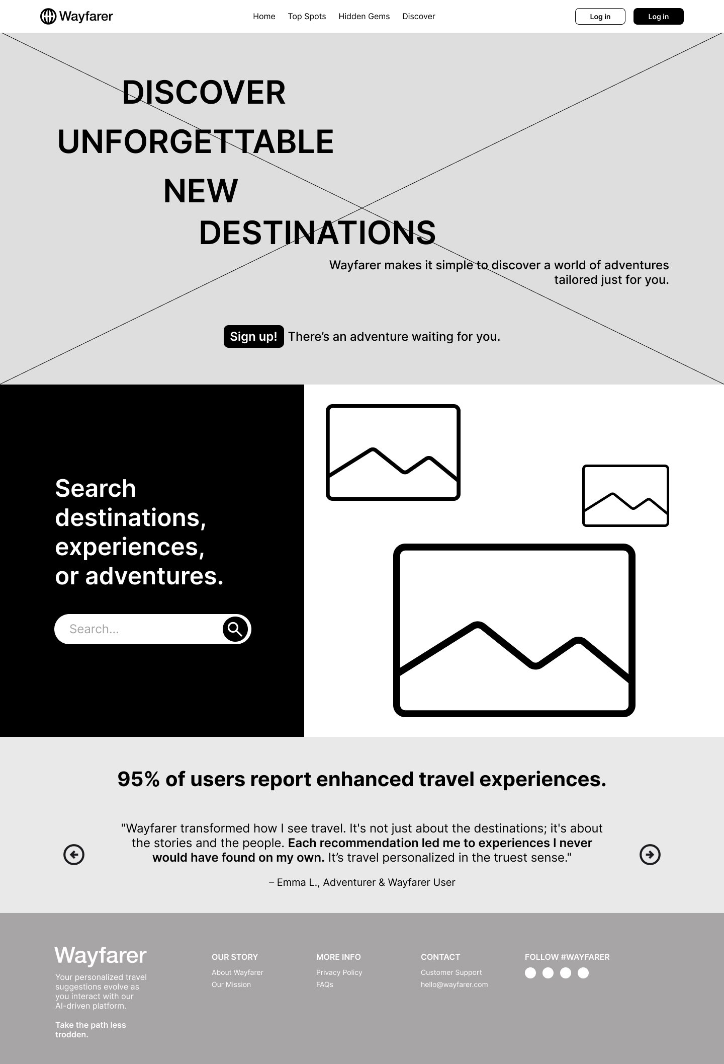
Initial wireframe | Tried to anticipate visual design, but in retrospect, should have focused more exclusively on UX first
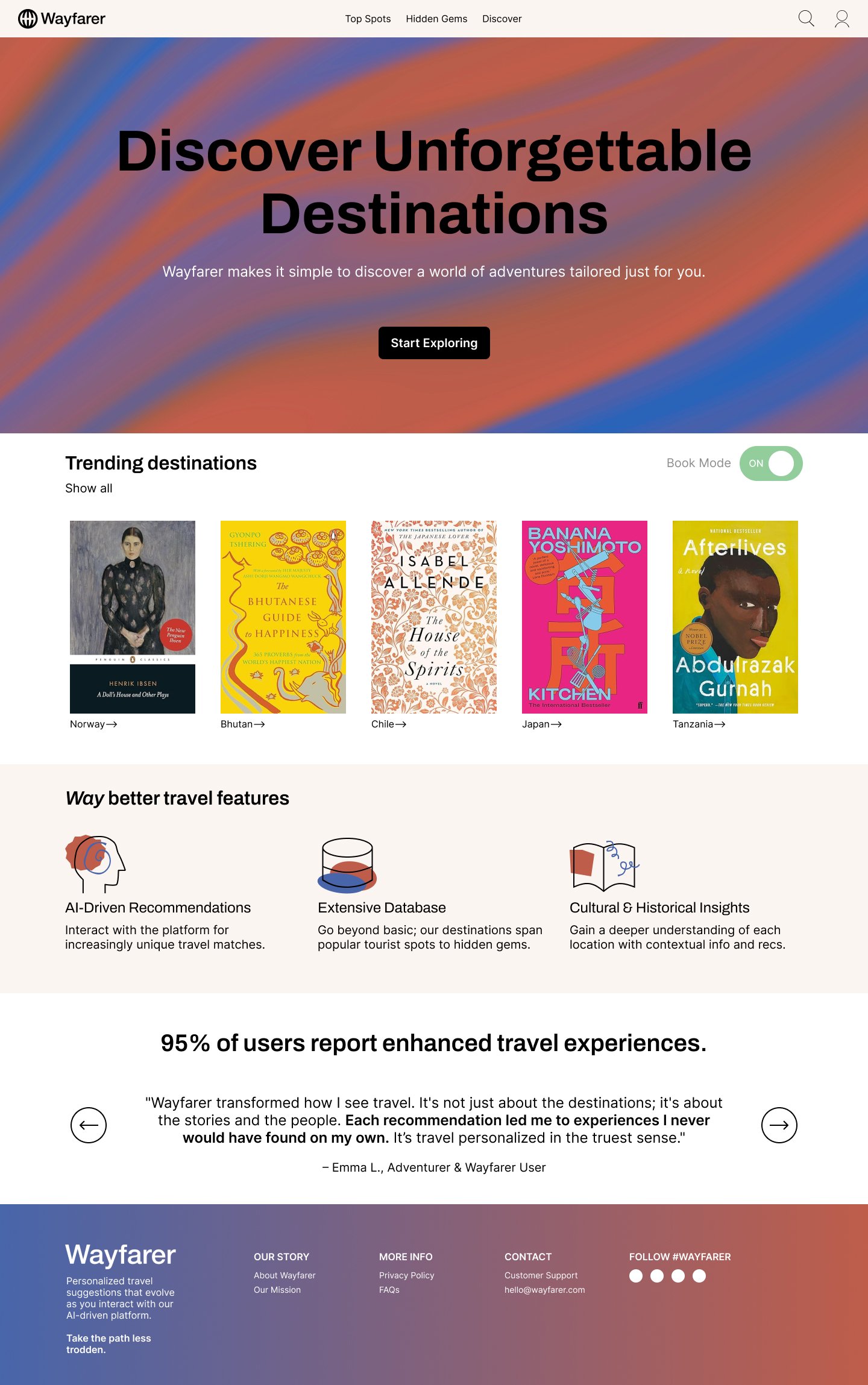
Initial design | Needed substantial refinement (e.g., accessibility enhancements), but has many of the elements of the final design
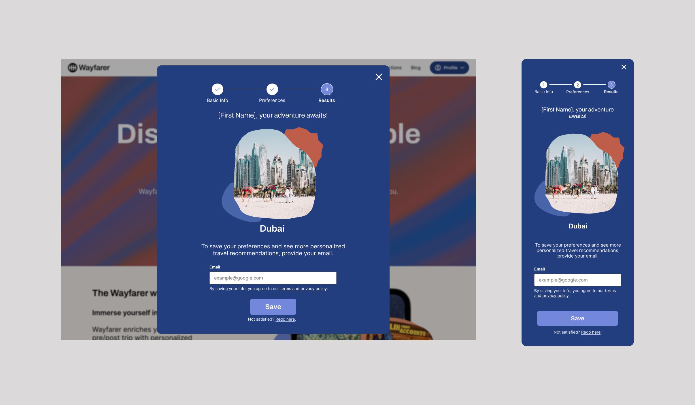
Final design - webform example | Breadcrumbs serve as a navigational element & emphasize that form completion is as easy as 1, 2, 3. Users receive teaser content (sample destination recommendation), but they are encouraged to sign up to access more content/features. Users can also go back & refine their inputs, if desired